CASE STUDY
Bardon Hill
Client: Harworth
Studio: Reach Marketing
Deliverables
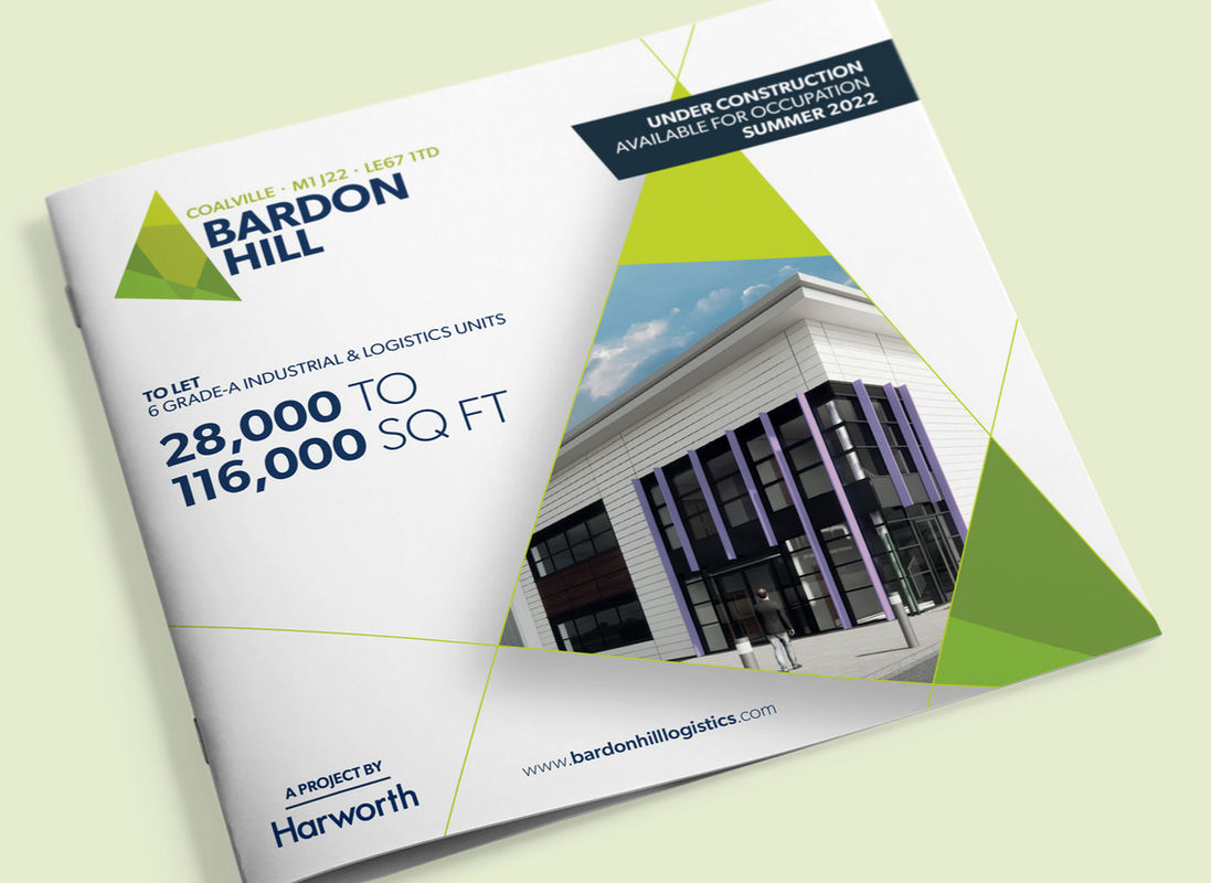
The Bardon Hill campaign was a true partnership from start to finish. From the creation of the brand mark and campaign messages, to the graphical rollout, collaboration was a key driver of success.
Working closely with Harworth, and alongside colleagues in design and delivery, we built a brand, messaging platform, and collateral that was clear, consistent and commercially sharp.
That teamwork paid off: a number of prelets were secured and Bardon Hill was fully let within just 18 months of launch. This strong result underlines the effectiveness of a campaign built on clear strategy, strong creative, and seamless collaboration between internal and external stakeholders.
Brand mark ideation.
The best logos, in my opinion, tell a story. A mark should communicate the essentials of a brand: its character, quality, and aspirations. Although this semiotic process happens largely subconsciously, underestimating our audience’s ability to make these value judgements does them a significant disservice.
When Harworth approached Reach Marketing, the client had already chosen the name for their latest development outside Coalville: Bardon Hill. I began the design process for the brand mark by exploring multiple concepts that drew inspiration from the site's geography and purpose, testing a number of themes to find the most effective visual narrative.
The final mark emerged from these early explorations: a dynamic arrow-shaped device formed by the routes intersecting around the location. The first iteration used an orange palette to reflect the site's position at the apex of the so-called logistics 'golden triangle', but following client feedback, this was revised to a green palette to highlight the development’s sustainable credentials. Alongside the mark, I developed a carefully designed wordform, ensuring the typography was clean and balanced.
The result is a logo that is both meaningful and distinctive. Even if the viewer is not consciously aware of the story behind it, the design communicates location, sustainability, and momentum – everything a property brand identity needs to say at a glance.
Campaign copywriting.
Every successful campaign needs clear, consistent messages that speak in the brand’s voice. With the Bardon Hill brand mark agreed, I set about developing a platform of versatile campaign messages to be used across multiple channels and activities.
Before starting any property brand identity or campaign, I always carry out detailed research into the offer, delivering my findings to the client for approval before copywriting begins. This process ensures the messaging platform is accurate and tailored to appeal directly to potential occupiers. It also highlights any gaps in information upfront and reduces the need for later rewrites.
Working within Harworth’s straightforward tone of voice, I created a set of concise, benefit-led messages that addressed occupier priorities, from specification and location to sustainability and workforce. These were organised under seven messaging pillars, ensuring the platform had the depth of messaging needed to sustain the campaign.
To support the longer campaign lifecycle, I also wrote milestone messages for development waypoints, giving the team something relevant to say at every stage of delivery. These updates helped maintain momentum while reassuring the market with clear, timely communications as the site progressed from groundworks to completion.
The outcome was a set of messages that were simple, credible, and flexible: a toolkit that kept the Bardon Hill story relevant and compelling across all channels and activities.
Graphic delivery.
The visual identity for Bardon Hill was very much a collaborative effort. Here I worked closely with my much-missed colleague, Lisa Penrose, to design and deliver the campaign collateral.
Together we discussed my ideas for the overall look and feel. Lisa then took the baton and ran with it, developing our conversations into a bold, visually striking design direction that perfectly captured my ambitions for the project.
To support Lisa's efforts, I focused on producing the more time-consuming assets, including detailed maps and site plans, and helped roll out individual pieces of collateral across different formats. This partnership ensured that every item, from headline visuals to technical details, was aligned and consistent.
The result was a suite of materials that not only looks strong but also worked seamlessly as part of the wider campaign.


